WeQual
The brief
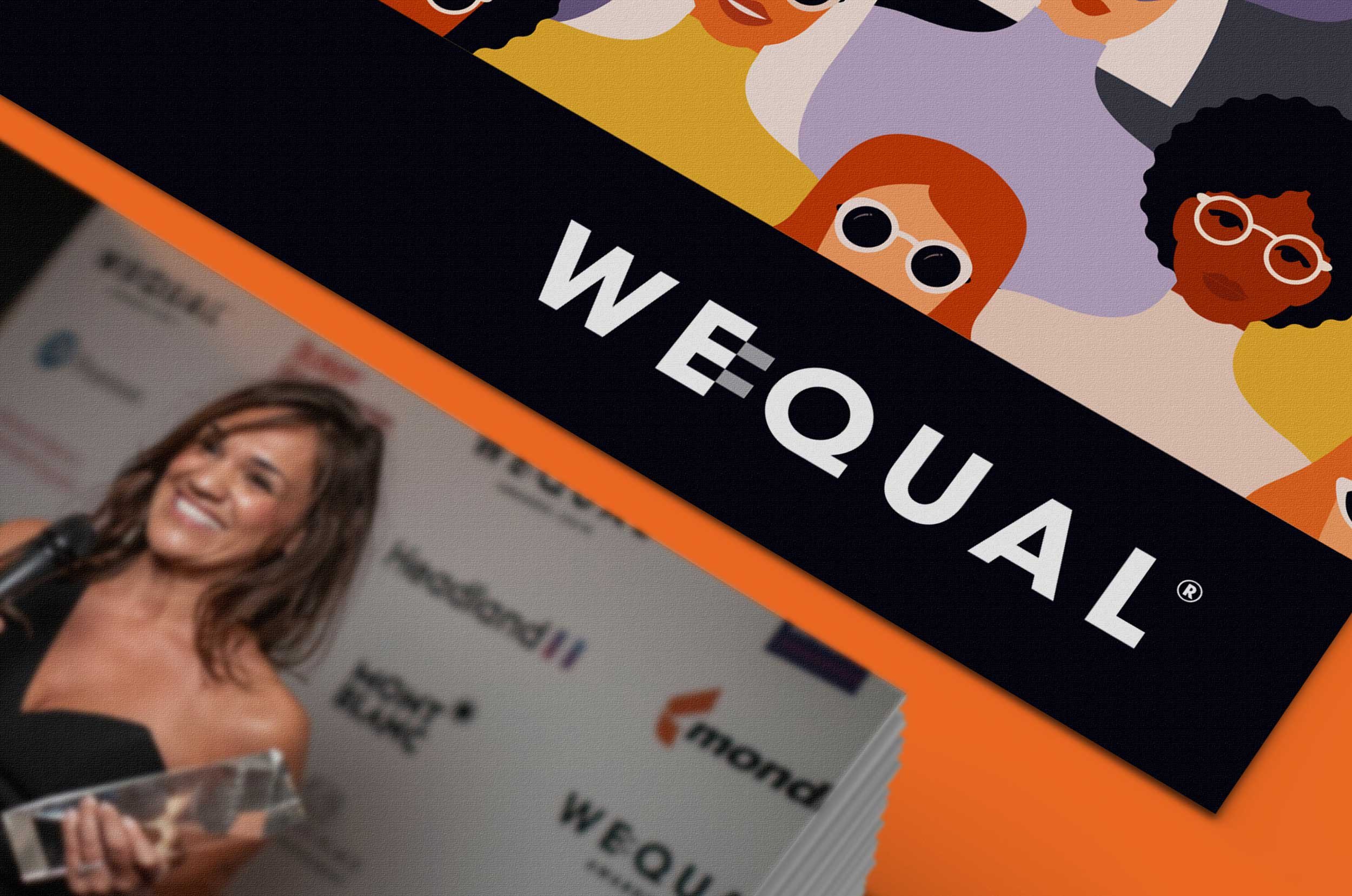
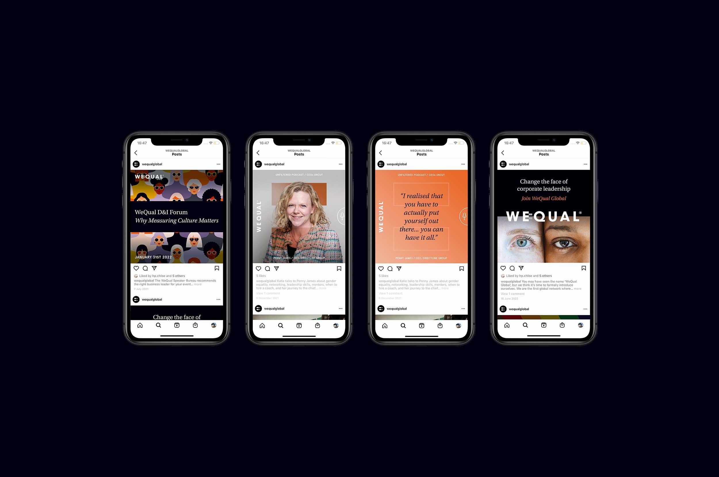
WeQual’s mission is to achieve 50/50 gender parity at the top of the world’s largest companies. WeQual aim to meet this target through various services, including consultancy, global awards, podcasts and a global membership platform. As the organisation’s first in-house Graphic Designer, Jasmine begun her new position with an entire brand update. She created new brand guidelines for the company, which included a fresh colour palette, the addition of typefaces and brand assets; she even developed a visual language for WeQual. Since then she has been upholding the brand, ensuring that consistency and quality is maintained throughout all customer facing material, from social media assets and presentations to sales brochures.

An inclusive brand
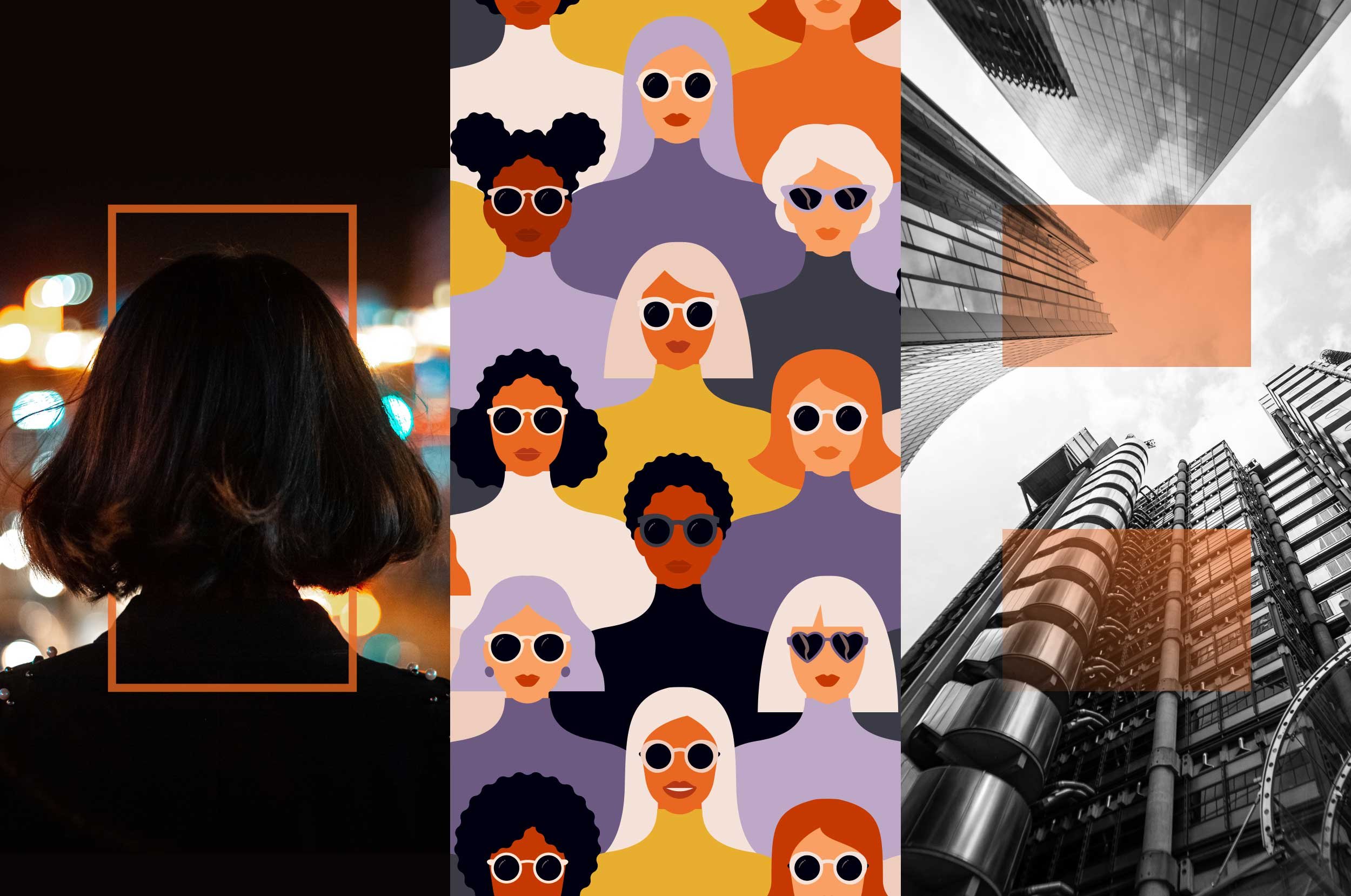
WeQual required a brand update that created the perfect 50/50 blend of ‘corporate’ and ‘approachable’. A tricky combination to fuse, the brand needed to feel inclusive and friendly, but also serious about the mission. Jasmine introduced a serif typeface to create a softness and sense of approachability, whilst retaining the original sans serif with its corporate appeal. The updated colour palette utilised the original combination of bold orange and black for their strength, Jasmine then added soft pastel complementary colours which were inspired by the beautiful tones of a sunrise. The concept behind this was to bring the positivity and energy of the dawn of a new day - feeding perfectly into the brand’s fresh narrative and unique mission to create positive change for women globally.

Flexible design
During the brand update Jasmine explored ways of using the logo mark to continue the juxtaposition between ‘corporate’ and ‘approachable’. She discovered that the icon could be used as a feathered or gradient overlay to create softness; or to use the asset as a solid shape, which evokes power and strength. Imagery can also follow this narrative - ambassador and lifestyle photography, and simple illustration bring a human side to the brand; which is used alongside striking architectural shots and informative infographics to bring the message back to business. Similarly, the strength and corporate tone of imagery can be altered depending on the document and audience; manipulating imagery with black and white or monotone effects can give photography a more serious feel.
